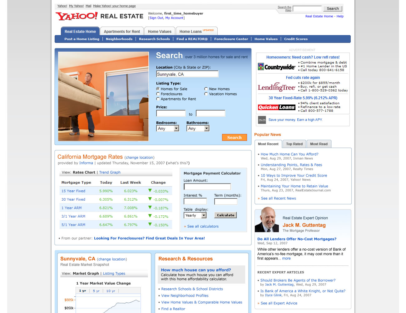
Starting point: a screenshot of the old Yahoo! Real Estate website.
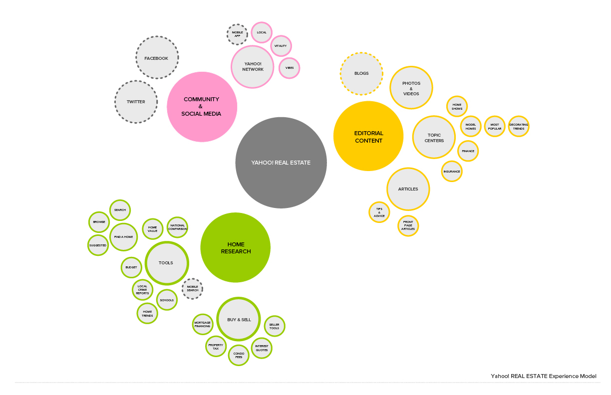
After a good deal of user research, we distilled the massive amount of information into a simple experience map around the core tasks and interests of our target market. The green circles represent areas of highest value, yellow areas are secondary, pink being tertiary and peripheral areas we could tap into.
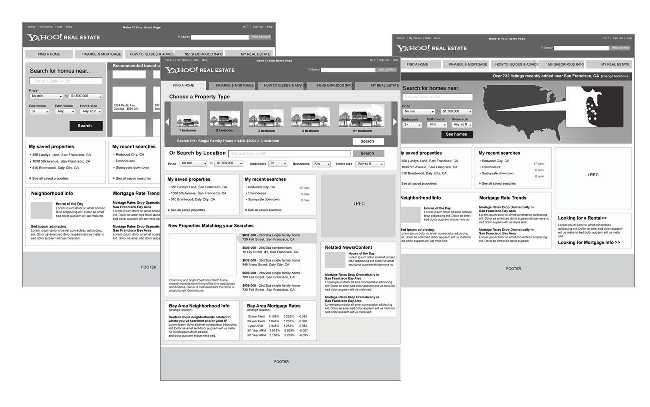
Based on the research and new/revised experience map, I started wireframing new potential concepts, interactions, and layouts.
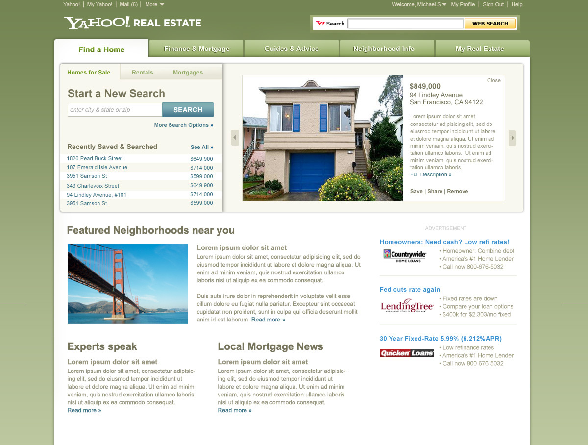
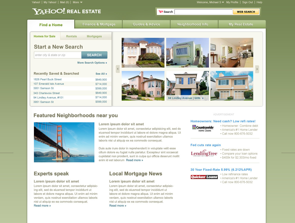
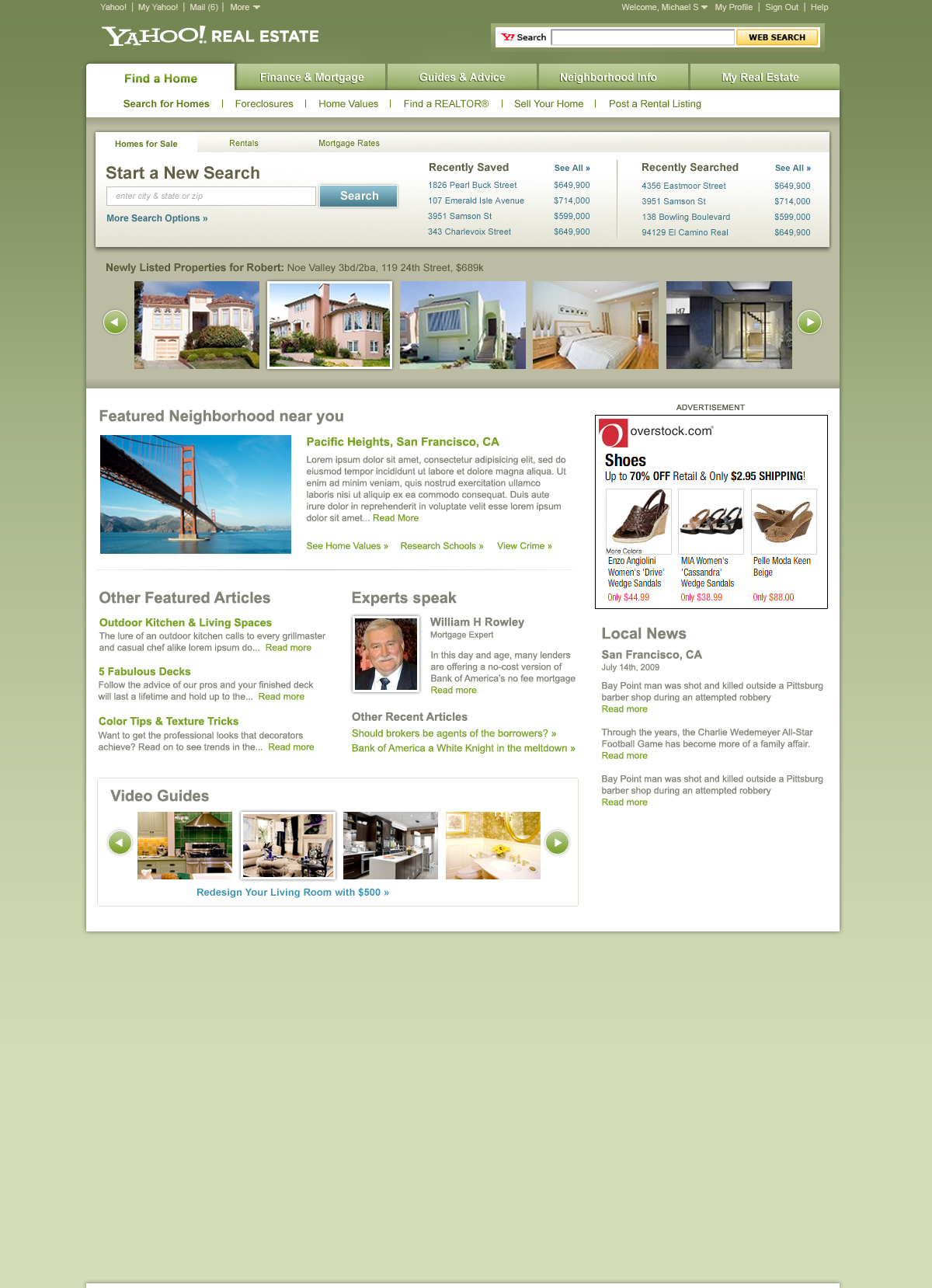
High fidelity visual designs concepts. Explored two different directions for A/B testing on clickthrough and engagement metrics.
