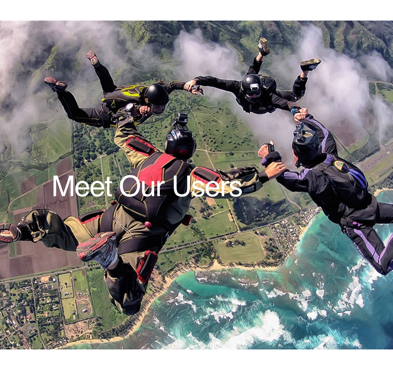
Process began with an understanding of both business requirements and most importantly our customer. We did a deep dive into a current market analysis (from third party vendor) and decided to focus on a couple of key user types - the 'extreme adventurer' and 'hardcore enthusiast'.
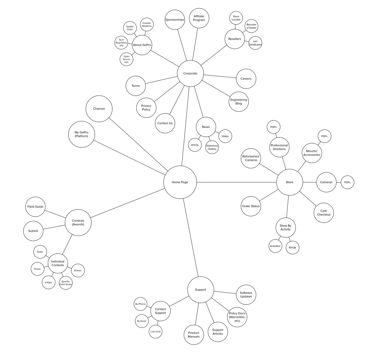
After a number of informal whiteboarding sessions, we move into building an ecosystem map.. where we took the time to understand how the various parts of our business might play into an actual homepage strategy. One example artifact is below.
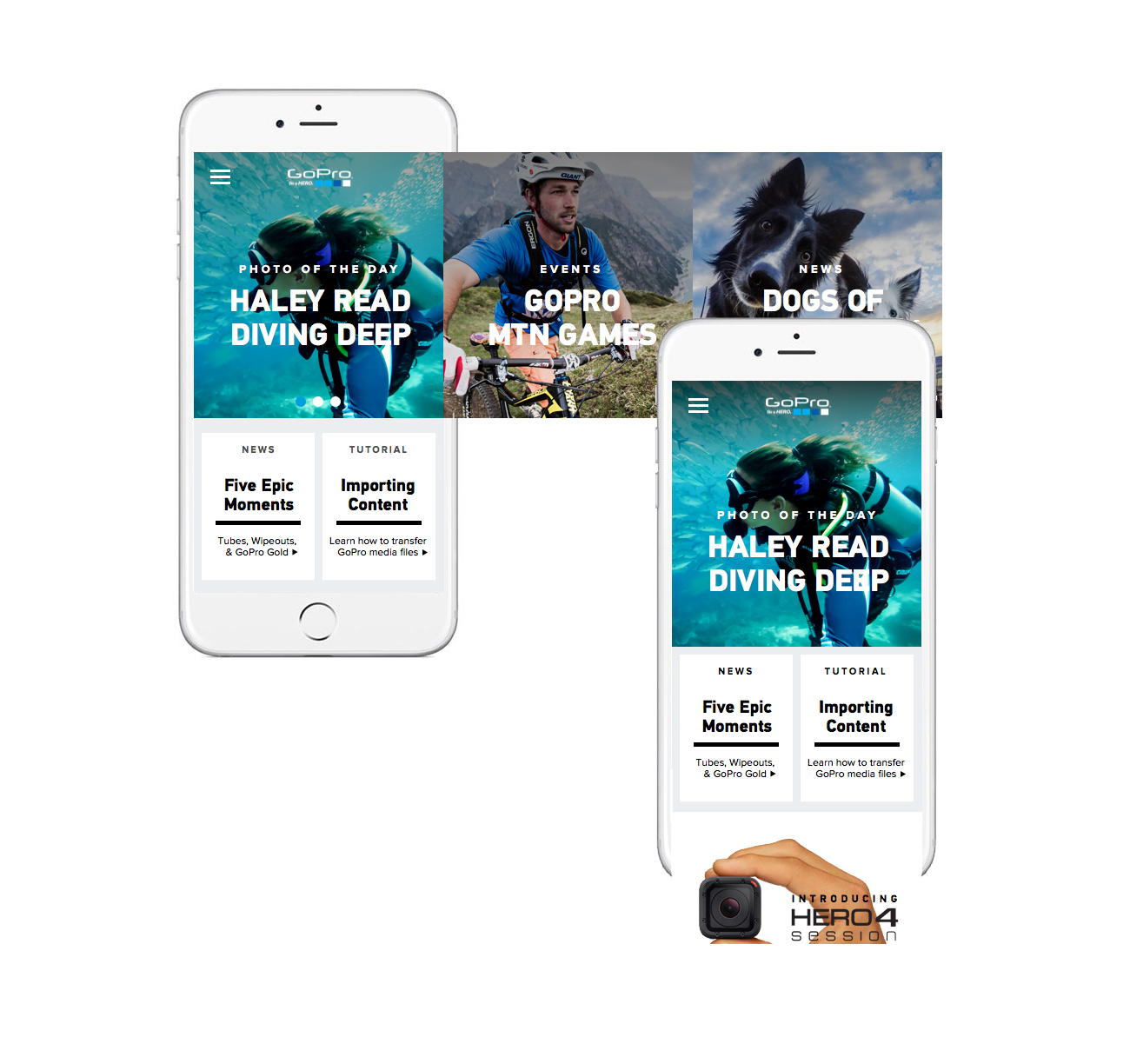
Finally, after a number of brainstorming and loose whiteboarding sessions, we quickly started working on a mobile first strategy that spoke to our 'on the go' typical GoPro persona - an avid outdoor enthusiast who might access the site casually while on a trip. We experimented with a number of feasible layouts for this persona that focused on their key activities (identified from the research)... 'watch', 'shop', 'join' etc..
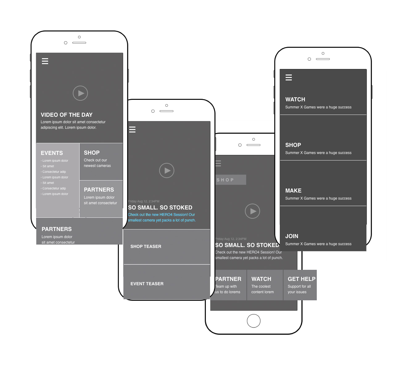
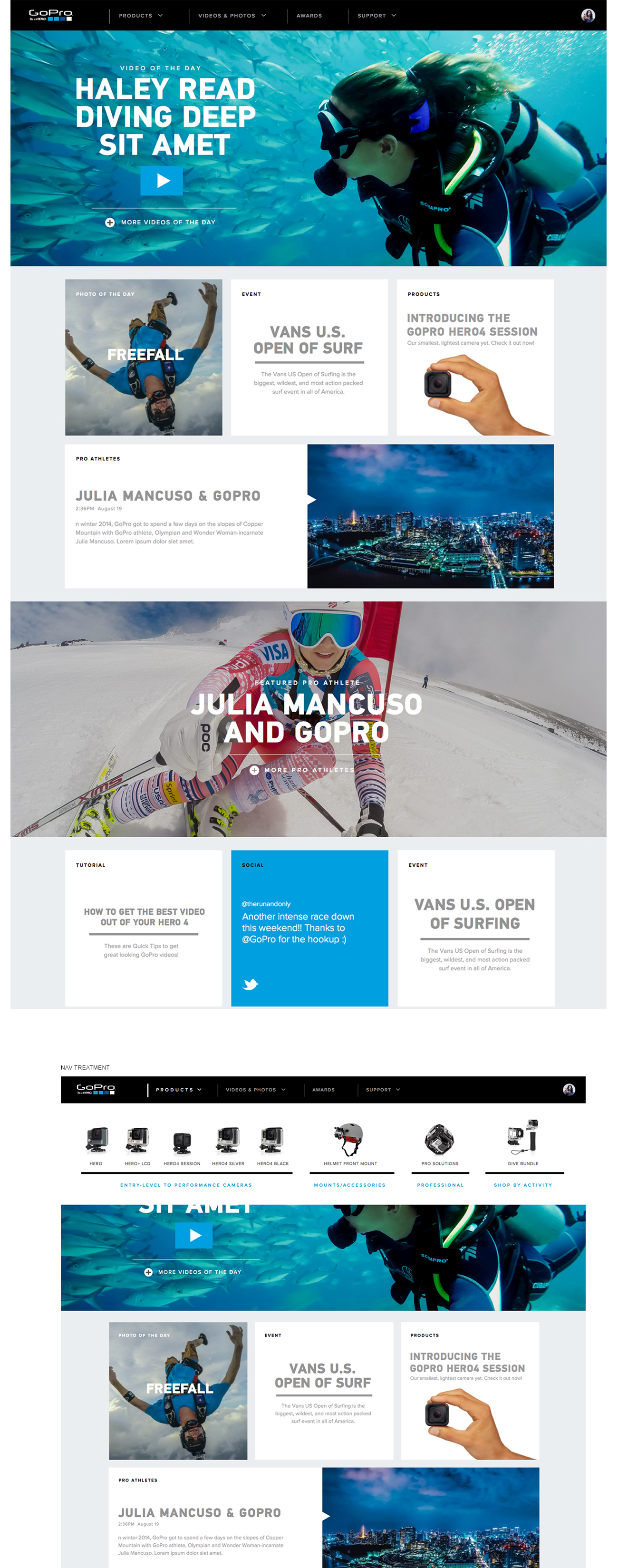
We also extended the explorations to desktop... as many users would go through awareness/discovery phases on mobile, but move into desktop as their purchase consideration became more serious.
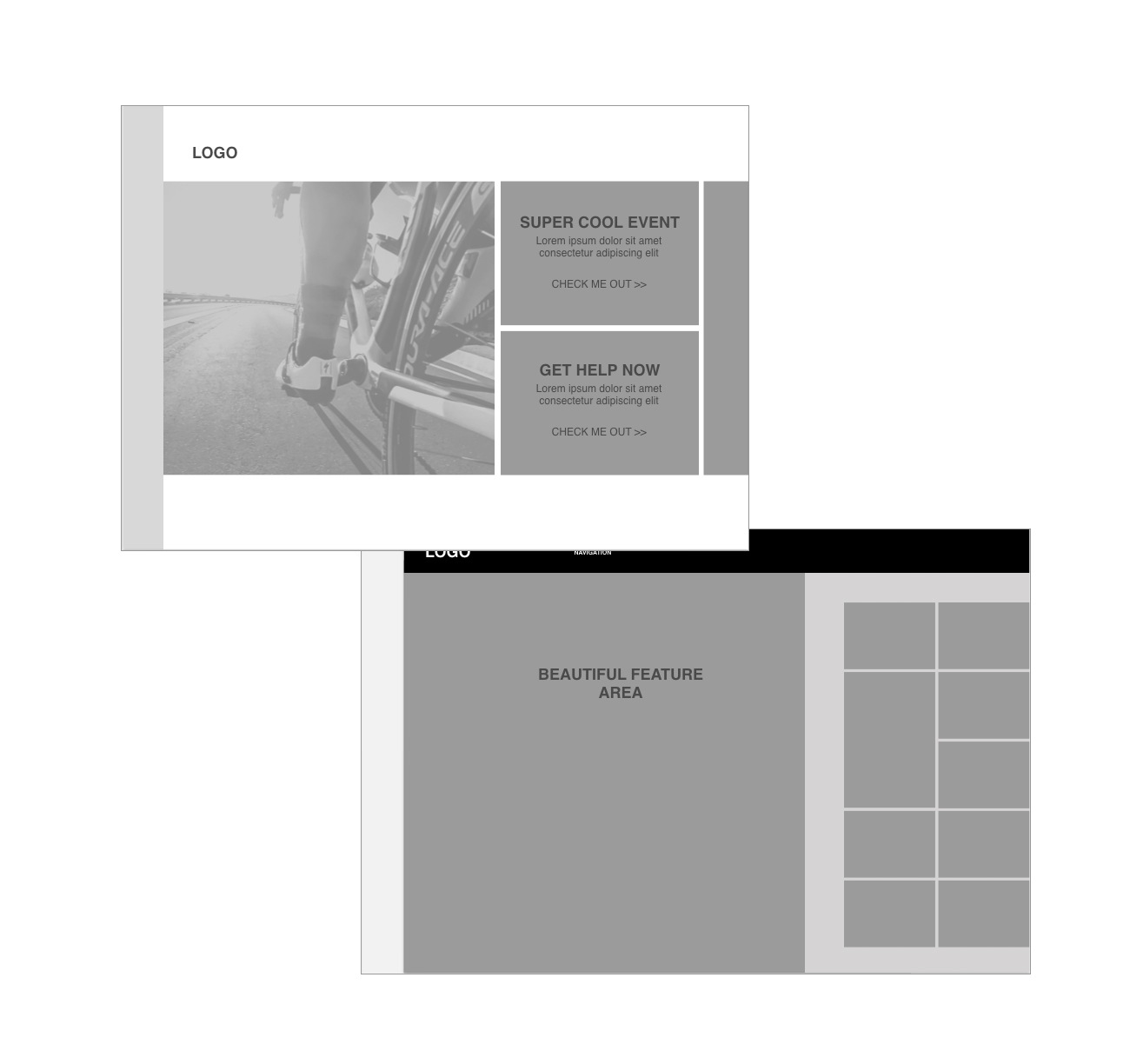
And finally.. moved into high fidelity visuals for both mobile and web..
